X&I Entertainment
Two lists of names anyone would envy, in two grey paragraphs nobody read.
X&I Entertainment is Alexander «Xandi» Dimitrov's company in Munich: promotion, marketing, video and a label of its own, X&I records. Before it came thirteen years at BMG and Sony, ending as head of promotion at Ariola and RCA.
- What we saw
- Whoever hears his name looks him up on a phone, and found a barely legible 2015 site with 52 artists hidden in two grey paragraphs.
- What we changed
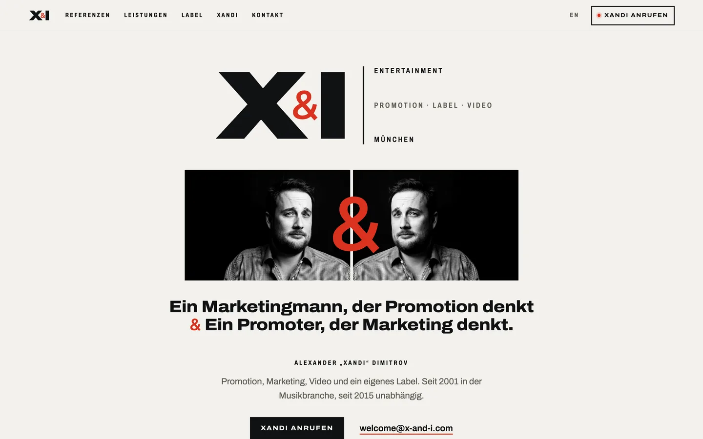
- The two lists face to face with the & at the centre, his own line as the opening, and a site built for the phone, secure and bilingual.
- Status
- Independent study, private build; his current site is untouched.
Read the full case
What we noticed
In his trade you get recommended, not found; but whoever hears his name looks him up, almost always on a phone. There they met a 2015 site with no mobile layout — body text at about six pixels — a security warning before the door, no title for Google, and no preview when the link was shared.
The strongest thing he had — 29 artists from his years at BMG and Sony, 23 since 2015 with X&I — sat in two grey paragraphs; the wall of covers was a thumbnail. Nothing said that he now shoots videos and releases records too.
Why it mattered
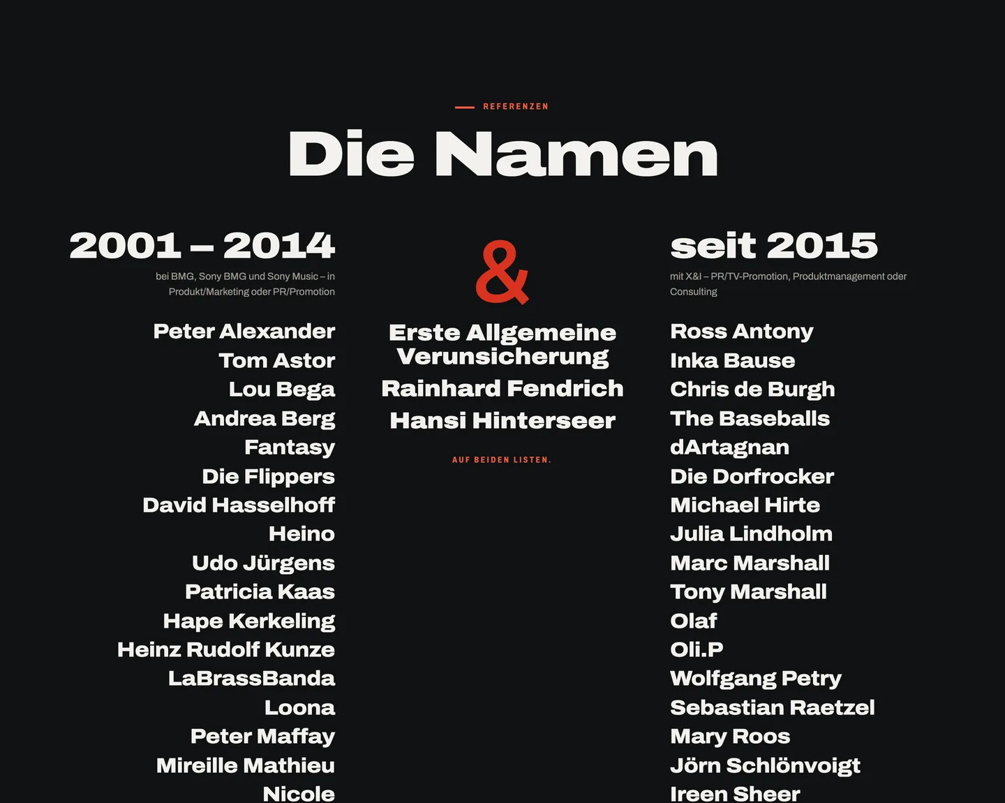
In promotion, what gets bought is trust: who you have looked after and who you still work with. He had the names — three of them, Erste Allgemeine Verunsicherung, Rainhard Fendrich and Hansi Hinterseer, on both lists — but the site hid them and told the story of a company that stopped in 2015.
What changed
The proposal presents him as what he is: one man capable of handling big names, with promotion, marketing, video and label in the same hand. It opens with his own line — «Ein Marketingmann, der Promotion denkt & Ein Promoter, der Marketing denkt.» — and with him twice, the & between them.
«Die Namen» sets the two lists face to face, the & between them and the three who appear on both at the centre. The & in his logo, which was already his name, was redrawn as a classic ampersand, red like an on-air light, inside the X — a proposal; his logo stays his. Underneath: https, legible on any phone, German and English, no cookies, no tracking, and the call button always in reach.
What became possible
A site where the first thing you see is who he has worked with. It's a study: his current site is untouched and the proposal lives in a private, unindexed build. Publishing it would still need his current artists, his TV placements and the label's catalogue, and a review of the legal notice and privacy policy.
The names, at last, the first thing you see.
An independent design study, published with Xandi Dimitrov's permission.