Lactavisa
Four brands, twelve references and a single health-registration number behind all of them — and it was already published.
Lactavisa — Lácteos Avilés, S.A. — is a UHT milk plant beside the port of Avilés, running since 1972. It packs four of its own brands and also manufactures for companies that want to sell under theirs.
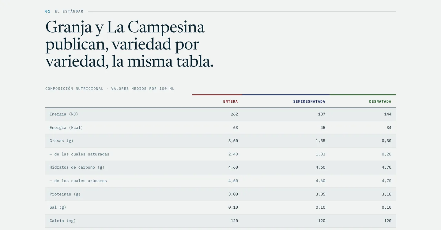
The answer wasn't in an interview, it was on their own website: twelve downloadable spec sheets, one per reference. All twelve were read. Granja and La Campesina publish, variety by variety, the same nutritional table down to the last decimal — 262 kJ, 3.60 g of fat, 120 mg of calcium — and all four brands share a single health registration, ES-15.00913/O. One plant, one line.
What changes from one brand to the next is the carton and the barcode. The milk and the analysis do not. Nobody was hiding it: it was published, reference by reference, and no page said it out loud.
A plant that packs somebody else's brand lives on one thing: the buyer trusting that their product will come out exactly like the house one. That guarantee is hard to assert without sounding like a brochure — and here it didn't need asserting, because it was already documented.
The work stopped being persuasive and became editorial: arrange what the company already published so that the buyer reaches the conclusion themselves. Whoever orders their own brand enters the same registration, the same line and the same analysis. There is no second category of product because there is no second line to make it on.
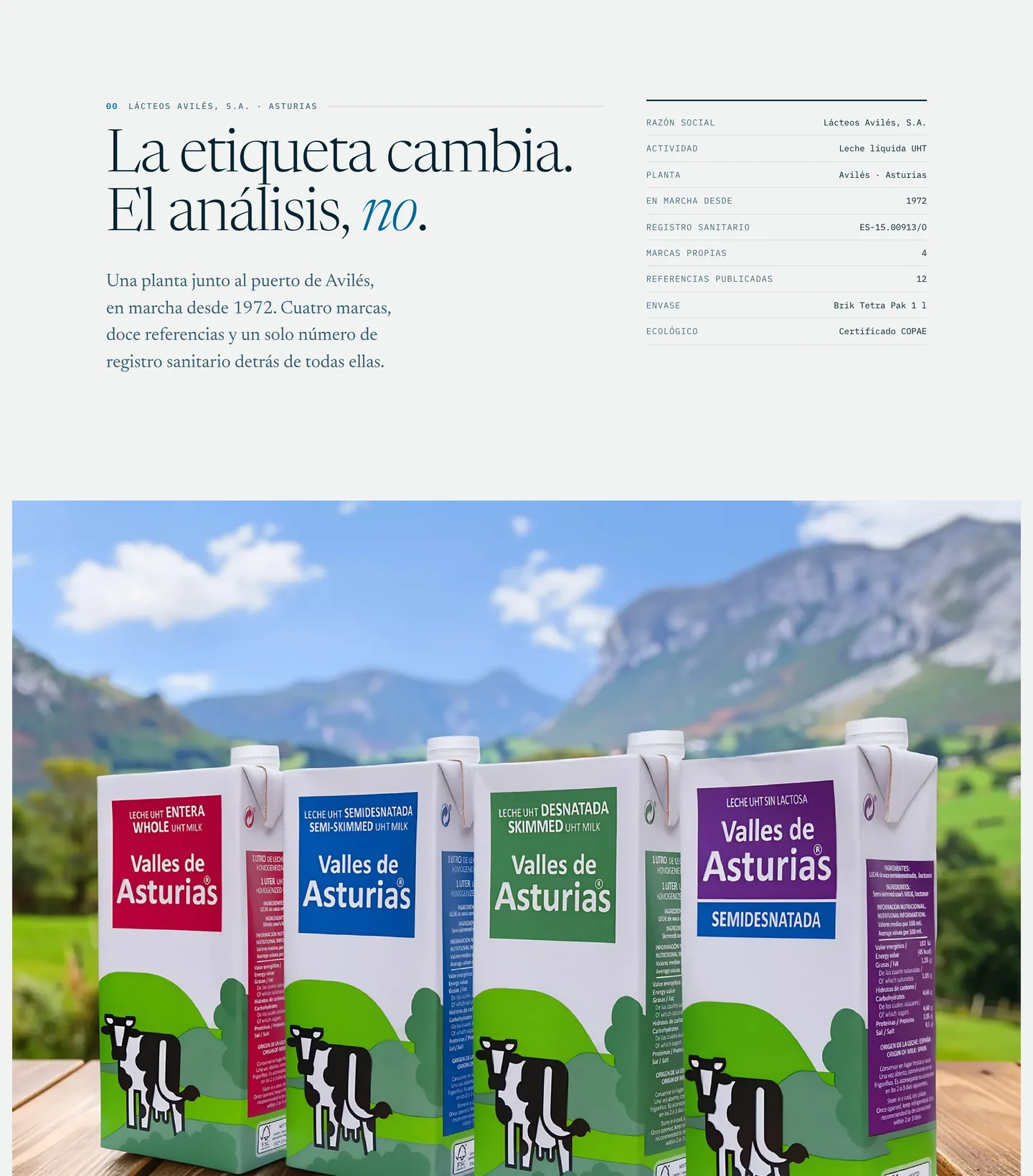
The site was written as a record, not as a sales catalogue. It opens by saying what it is — «La etiqueta cambia. El análisis, no.», the label changes, the analysis doesn't — with the company's own details beside it: legal name, plant, year, health registration, brands, references.
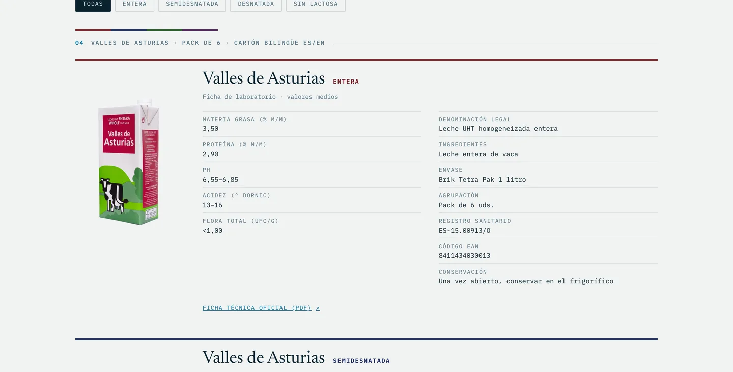
Then comes the proof, without adjectives: the identical nutritional table, reproduced exactly as they publish it. Then the catalogue — twelve references, each with its spec sheet (fat, protein, pH, Dornic acidity, total flora, legal denomination, allergens, barcode, storage) and a link to each official PDF. Each variety's colour on the carton is the colour that heads its sheet: the catalogue is read before it is read.
Where a fact was still open — the legal form, which their own site writes two different ways; the plant certifications — it wasn't filled in. It was left out.
A plant that can stop promising rigour and simply show it, with the document in front of you. It is the commercial argument that matters most to them — the client's own brand — carried by their own paperwork rather than by our copywriting.
It's a study, and a second direction: an earlier, different proposal exists and is still the one the client has on the table. None of this is launched or indexed, the client has already said they like what they have seen from us, and there are no results to show.
Nobody needed convincing — only what was already published needed ordering.
An independent design study, published with Lácteos Avilés's written permission. It is our own concept, not the company's website, and the site is not public. The atmosphere imagery is illustrative, as the page itself states.